Last Updated on November 5, 2022 by Lawrence Berezin
NYC DOT to replace 6,300 old parking signs with redesigned parking signs
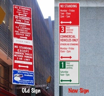
The DOT unveiled the redesigned parking signs in Manhattan this past Monday. And I love them. Because the new signs are a significant step ahead in promoting parking sign understandability.
The sign people will install the first wave in Manhattan’s commercial parking areas. This area generally runs from 60th Street downtown to 14th Street. And from Second Avenue to Ninth Avenue. There are more commercial locations on the Upper East Side, Lower Manhattan, and the Financial District.
The mighty rulers of the parking sign universe will spit the new signs between 3,300 commercial signs and 3,000 nighttime and weekend parking. Meanwhile, they will install future signs in the outer boroughs.
Did you know the NYC DOT partnered with a world-class designer to redesign NYC parking signs?
Michael Beirut has won hundreds of design awards. Most importantly, Mr. Beirut, a New Yorker, has suffered the slings and arrows of New York City’s indecipherable parking signs:
“Occasionally, I drive and try to park on the street. Likewise, the parking signs confuse me,” explained Mr. Beirut.
He lives in Westchester and usually takes Metro-North into the city. But, warriors and cops give him parking tickets when he drives into the City. And Captin Hook towed Mr. Beiru twice. “I am so suspicious now that I will park in a garage for even a 15-minute errand.”
You can find Mr. Beirut’s work in several permanent collections, including:
- The Museum of Modern Art and the Cooper-Hewitt,
- National Design Museum in New York;
- The Library of Congress in Washington, DC;
- The San Francisco Museum of Modern Art;
- The Denver Art Museum;
- The Museum für Kunst und Gewerbe Hamburg, Germany;
- And the Museum für Gestaltung in Zürich, Switzerland.
Mr. Bierut served as the:
- National president of the American Institute of Graphic Arts (AIGA) from 1998 to 2001
- Senior critic in graphic design at the Yale School of Art
- Co-editor of three Looking Closer graphic design anthologies.
- Founding writer of the Design Observer blog with Rick Poynor, William Drenttel, and Jessica Helfand
NYC parking sign redesign factoids
- The old parking signs contained information that was wordy and hard to follow.
- Typography was centered and set in all caps in various fonts and sizes, making it difficult for the eye to scan.
- Messages were stacked on different placards in various combinations up to 60″ high, with restrictions for commercial vehicles in red and passenger cars in green joined by more signs in blue reminding drivers to pay at the Muni-Meter
- Prior to the parking sign redesign, NYC used to have signs with 250 characters on four different signs in three different colors
- “The biggest challenge was creating really functional as well as beautiful designs that still conform to the somewhat archaic regulations that govern US traffic signs,” said Michael Beirut
- The signs are divided into two sections, one for commercial vehicles (still in red), and the other for passenger vehicles (in green)
Keep Reading!
- The several hours parking is allowed is prominently placed in a reversed-out box at the top left of the sign.
- Everything is aligned to the left
- Typography appears in both upper and lower case,
- Typography is set in a uniform font, Highway, widely used in US DOT signage.
- The superfluous blue signs have been eliminated altogether; Muni-Meters have been the only way to pay for single-space parking since 2011.
- The new signs are shorter—no taller than 48″—and hence more efficient to make.
- Redundant language (“6-hour parking from 6 pm to midnight”) has been eliminated or reduced and the number of characters explaining the rules on each sign pared from 250 to about 140—perhaps showing the influence of Twitter.
- The designers and DOT tested variables with various groups of New Yorkers to arrive at the most easily understood messaging. For instance, the hierarchy of information has been changed, with days now listed before hours. The tone of the language is now permissive and not prohibitive, telling drivers what they can do rather than what they can’t.
And the beat goes on
- “Design conventions for the parking signs were basically almost 19th century in their character,” Mr. Bierut said.
- The very first thing Mr. Bierut and his designers considered was bigger signs—”you always want more room to play with”—but that was quickly dispensed with because every sign in the city must hew to set dimensions dictated by the sign shop, in this case, 48 inches high by 18 inches wide.
- Beirut and his team of designers tried out various colors and weights and shapes and types of fonts before settling on the current layout. It is similar to the original, with commercial regulations on top, but now both signs have the same format, the only real difference being the color of the type and the outline—a federal regulation
- The other big debate was over the typeface. “We did one sign that used a custom Helvetica that we had designed for another DOT project,” Mr. Beirut explained. “It looked really beautiful, but in a way they looked like they would be perfect parking signs in Zürich or Geneva, and somehow didn’t seem New York enough. They felt a bit unnerving to the people at DOT, I think.”
- “The basic way these had been done is like a playbill for a music hall in 1845,” said Michael Beirut partner at Pentagram, the design firm that created the new look. The old way was, “Pick the most important thing and put that first, center everything,” and make it fit by changing font width and placement.
Still more information
- Shifting the focus from prohibitive phrasing to permissive phrasing. “The old signs read like,’ no one can park here except…’ So the new signs flip that to lead with the positive, what you are allowed to do,” Beirut said.
- The new look makes a few updates that seem obvious in hindsight like placing the day of the regulation before the hours of the regulation and eliminating abbreviations.
- The hierarchy of information is changed as well. The message of the threatening red “No Standing” sign is now blended with other parking regulations in these commercial parking zones. The big red sign is gone, its message captured with one line, “others no standing” added Mr. Beirut
- According to the DOT renderings, the messy blue “Pay at Muni-Meter” signs will also go. Once they were a necessary bit of visual clutter for the city’s transition away from old-fashioned parking meters. The last individual parking meter in Manhattan was jackhammered out of commission with cameras watching in 2011. So long ago that the DOT assumes drivers will know to look down the block for the new meters with a sign.
Yikes, one last paragraph to go
- One of the difficult things about information design is that the designer already understands what a sign is trying to convey, which makes it difficult to judge the effectiveness of a particular idea. Beirut and his team solved the conundrum by testing their designs on average city dwellers. “As we developed different versions, they were shown to various groups of New Yorkers who were generally given a simple quiz,” he explains. The subjects were shown a sign and asked whether, say, they’d be allowed to park there at 2:30 p.m. on a Tuesday. “By testing variables, DOT can help us set up the hierarchy and even word choice.”
[Sources: Pentagram, New York Observer, and Transportation Nation].
Commentary
Have I said that I love these redesigned parking signs? Yup, I do. One of the reasons is that members of the NYC Council are taking action to right the wrongs, and end the injustice foisted upon the NYC driving community by the Evil Empire’s relentless quest for shekels.
The NYC Council has enacted a plethora of new laws fixing some of the outrageously bad parking ticket behavior. Check them out:
- Have you Heard about the Terrific New NYC Parking Law?
- New Parking Law: Notice Required for Parking Meter Changes
- Do you know the Status of the Three Muni-Meter Bills?
- NYC Council overrides Mayor’s Veto of Sticky & Muni-Meter Bills
- Three Myths Debunked about the 5-Minute Grace Period
The Evil Empire didn’t build its draconian parking ticket system in a day. Likewise, it took years for the Empire to create this cash cow. While instilling a culture of money trumps truth, justice, and integrity.
Likewise, the Manhattan Bar Association has railed against it, and NY Supreme Court judges have overturned evil, corrupt decisions.
Why not start by removing the parking ticket judges from supervision by the NYC Department of Finance? Isn’t there an inherent conflict between the missions of Finance and Justice?
This is a wonderful trend, but now it’s time to work on the “enforced fairly” part.
FREE Download
But, if you don’t. Or, if you’d like to review or update your knowledge, why not download Larry’s guide to the meaning of these signs?
It’s FREE and will save you money!


They look good! And understandable, without having to to re- read them three times?!!
Signage is very important and so often badly designed.